

e-libee is a responsive digital platform designed for a fictional public eBook library. The project challenged me to take the product from zero to a fully interactive prototype, covering every major phase of the UI/UX design process: research-informed wireframing, visual identity, high-fidelity mockups, an iterated component library, and a clickable prototype.
Tools: Figma · Deliverables: Wireframes · Style Guide · Hi-Fi Mockups · Component Library · Interactive Prototype
Phase 1 / Planning
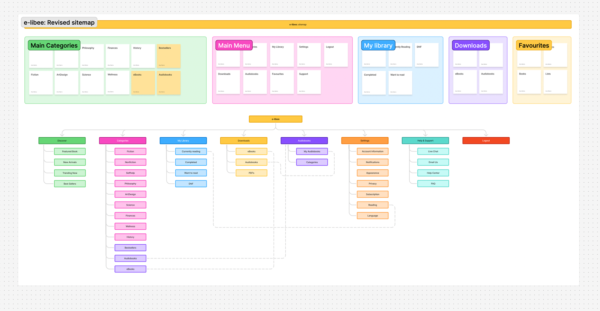
Needed a digital platform to launch their book browsing and reading experience. Before touching color or type, I mapped the core user flows: browsing a catalog, viewing a book detail page, managing a personal library, downloading content, listening to audiobooks, and handling account settings.
Phase 2 / Wireframing
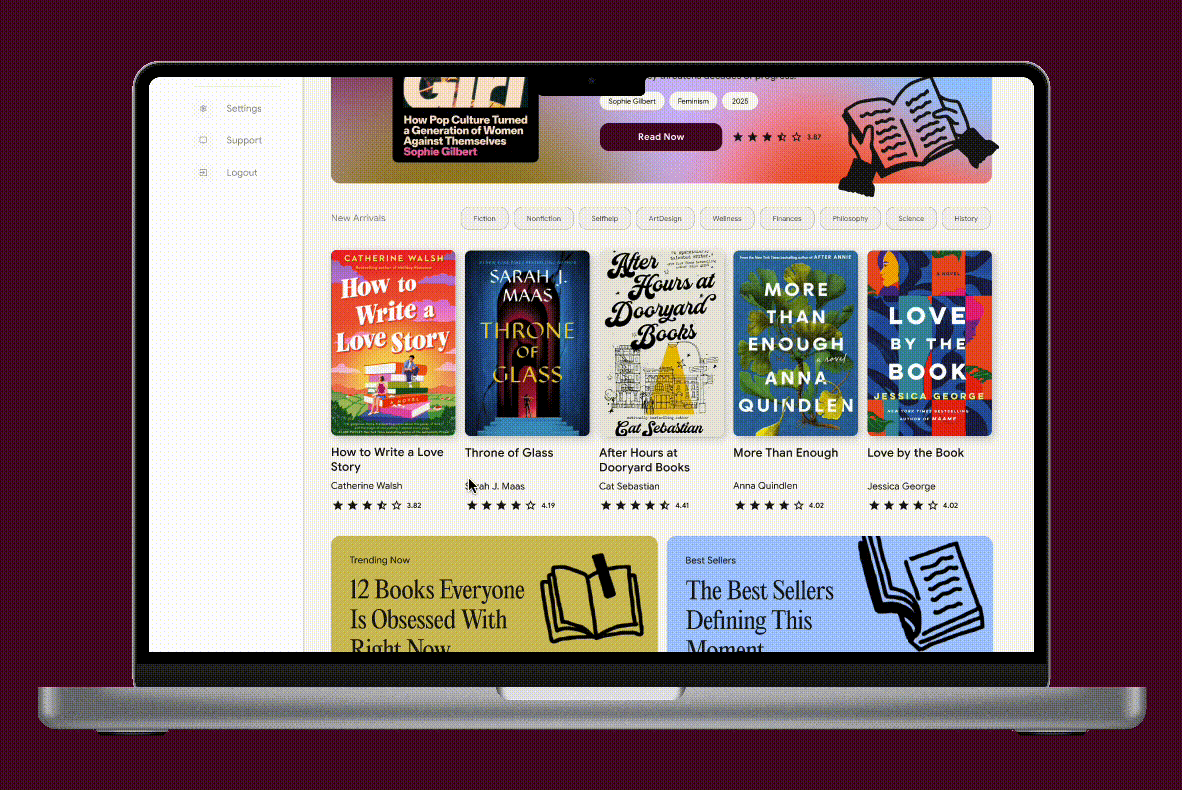
The wireframes were built at low fidelity first, focused purely on layout, hierarchy, and navigation logic. The sidebar navigation became a central design decision early on: eight destinations (Discover, Category, My Library, Download, Audio Books, Favourites, Settings, Support/Logout) needed to coexist without overwhelming the reading experience.
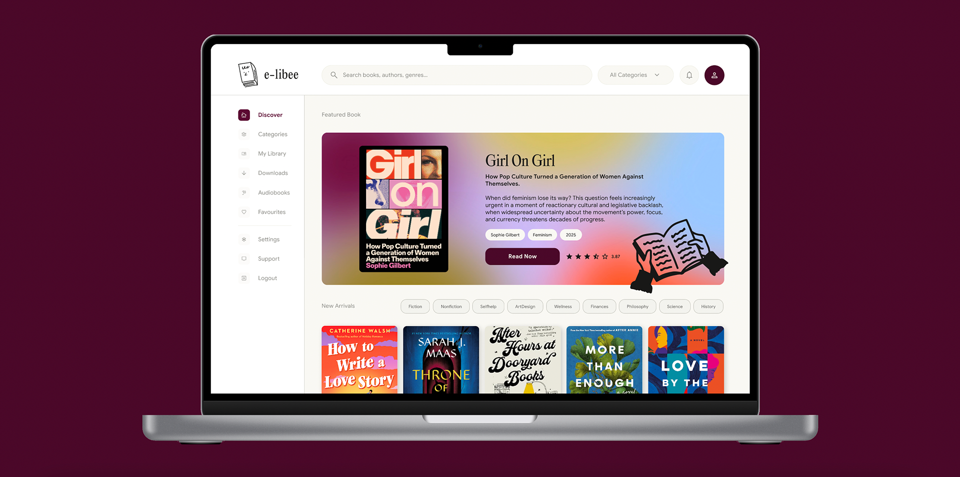
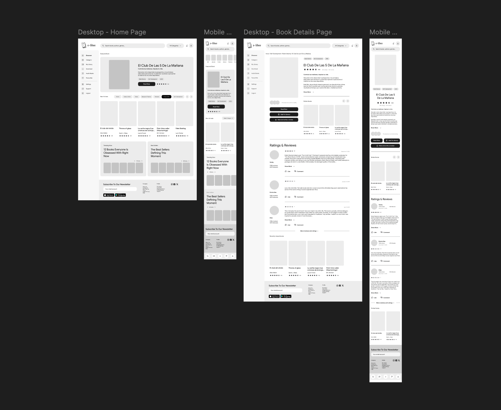
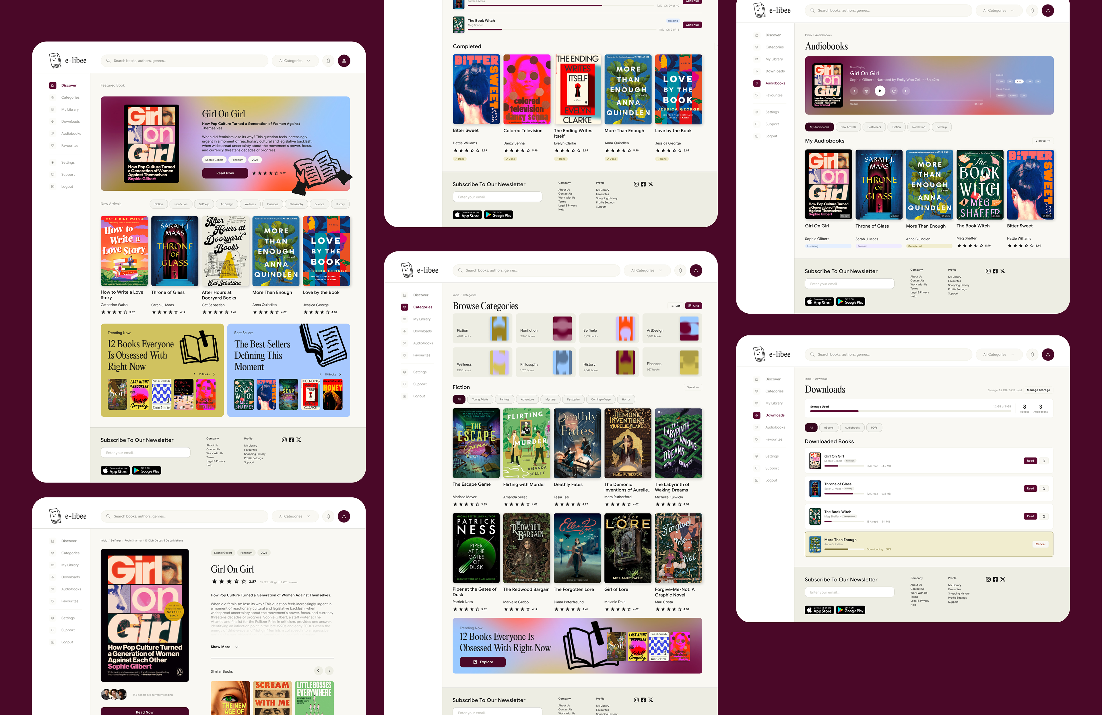
I decided to focus first on the key pages, the Home page and the Book Details page, to establish the core structure and user flow of the platform. This allowed me to move quickly into the design and branding phases while already having a solid wireframe and foundational layout in place.
My approach was to accelerate the structural work with AI-assisted support, while dedicating more time and attention to the visual design and overall user experience.
Phase 3 / Visual identity and style guide
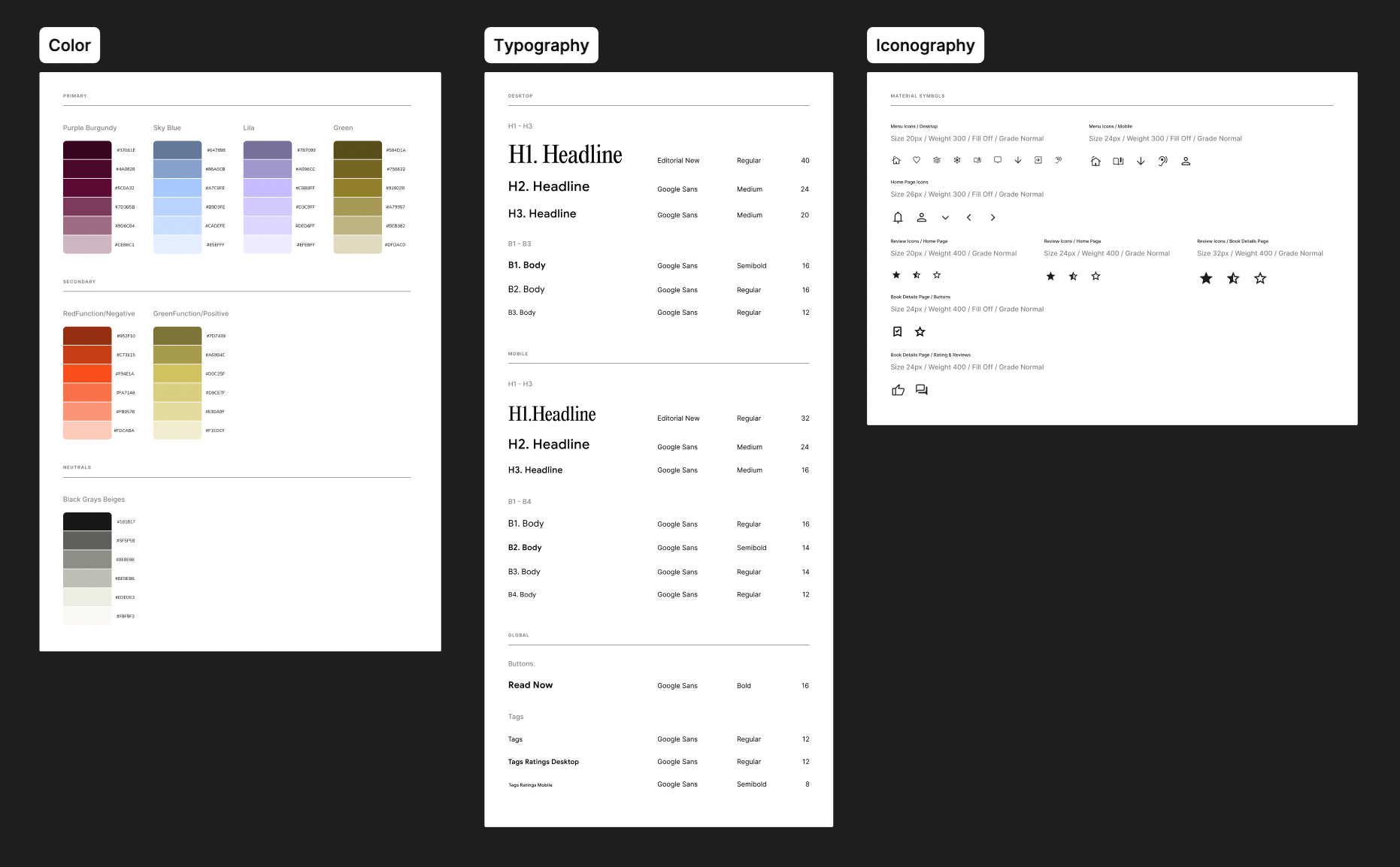
With the structure defined, I developed the visual identity. The brand needed to feel literary and trustworthy, not sterile like a tech product, but not overly vintage either. The name e-libee leans warm and approachable, so the palette followed suit. The primary goal was to establish the color palette, typography, and iconography, providing a solid foundation to experiment with during the high-fidelity design phase.
Phase 4 / High-fidelity design
With the style guide locked, I applied the visual system across the first two key screens, transforming the low-fidelity wireframes into polished, production-ready mockups.
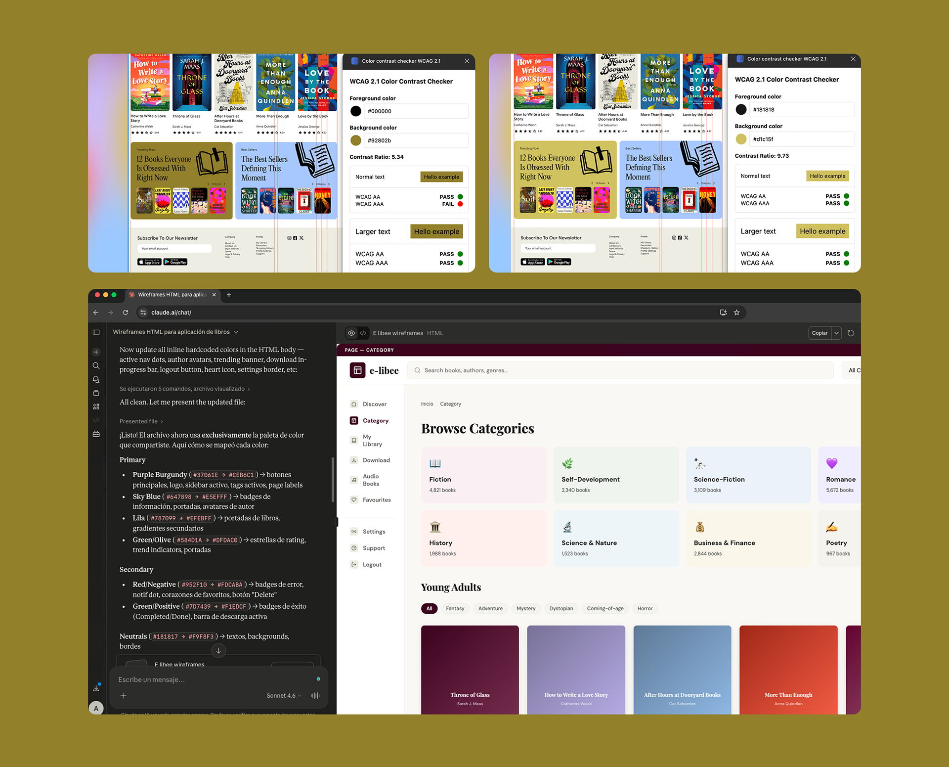
Throughout the process, I developed three design iterations focused on refining the structure, usability, and visual consistency of the interface. WCAG accessibility checks were also conducted on all text and color combinations to ensure sufficient contrast ratios and improve readability.
Once the initial design direction was defined, I used AI-assisted support to accelerate the creation of the remaining pages, later refining and aligning them to the final visual language and design system I had established.
A few design decisions worth noting:
⏯ The audio player. The Now Playing section on the Audiobooks page uses a gradient as its background, creating a distinct "mode" within the app, you know you're in a different kind of reading experience.
➡️ Reading progress throughout. Progress bars, reading status badges (Reading / Paused / Completed), and percentage indicators appear consistently across My Library, Downloads, and Audiobooks, reinforcing that the platform understands your relationship with each book.
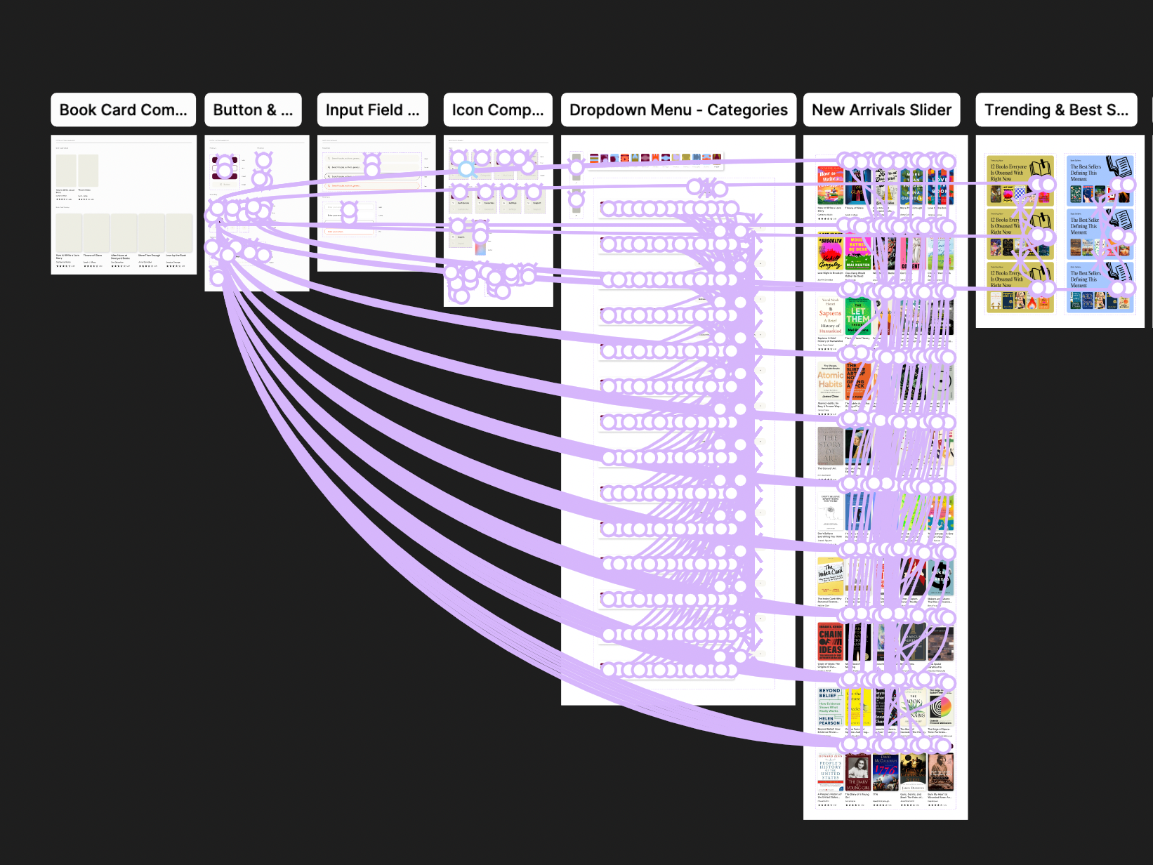
Phase 5 / UI Component library and interactions
Every repeated UI element was built as a reusable component:
👉 Book card (cover + title + author + rating)
👉 Category card (color-coded, icon, count)
👉 Tags / pills (default and active states)
👉 Buttons (primary, outline, ghost — all sizes)
👉 Badges (green/blue/orange/red semantic variants)
👉 Progress bars (reading progress, storage)
👉 FAQ accordion item
👉 Support contact card
👉 Audio player (controls, speed selector, sleep timer, progress track)
👉 Navigation sidebar (active state, hover states)
👉 Header (search bar, category dropdown, notification bell, avatar)
Each component was built with its variants defined, so swapping states across screens remained consistent throughout the iteration cycles.
Phase 6 / UI Prototyping and testing
The interactive prototype connects the ten core screens through the majority realistic navigation flows.
👉 Clicking a book card navigates to the Book Detail page
👉 Make sure the home page functions as it is intendend
👉 The sidebar navigation routes between all major sections
👉 The Download page reflects real storage state (progress bar, in-progress item)
👉 Settings navigates through its internal tab system (Account → Notifications → Appearance)
👉 Make sure the home page functions as it is intendend
👉 The sidebar navigation routes between all major sections
👉 The Download page reflects real storage state (progress bar, in-progress item)
👉 Settings navigates through its internal tab system (Account → Notifications → Appearance)
Multiple iteration rounds refined: the sidebar active state (contrast and legibility), the tag/filter system across Category and Library, the hierarchy on the Book Detail page (reviews section scroll, similar books carousel), and the spacing density across list views.