
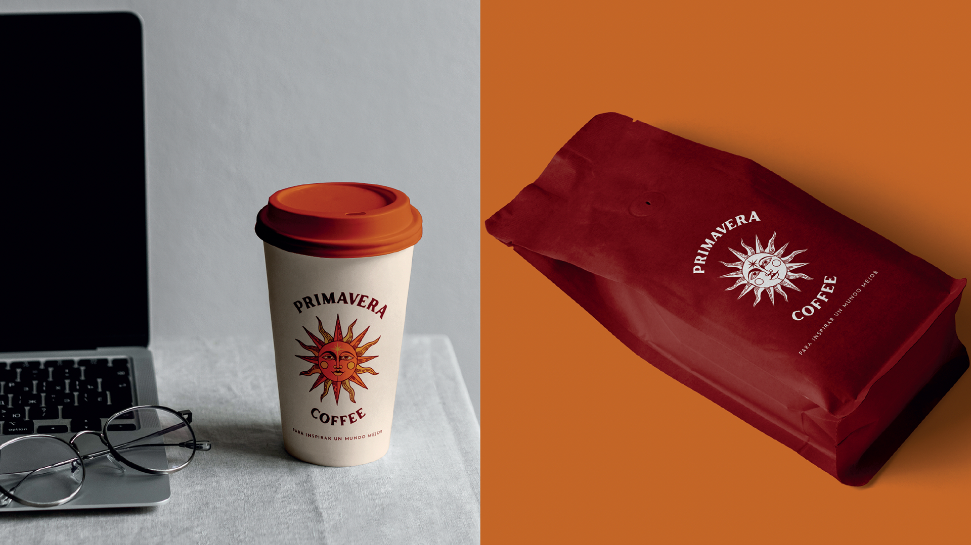
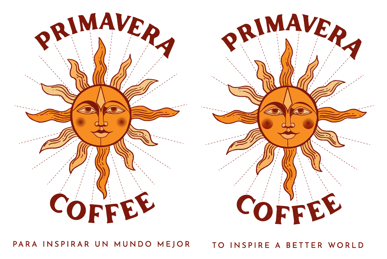
Primavera Coffee is a Guatemalan coffee shop offering a curated selection of coffee beverages and thoughtfully crafted food options. Its menu is defined by three key attributes: innovative flavors, consistent high quality, and natural ingredients, including vegetarian and vegan-friendly choices.
The brand exists at the intersection of two worlds: the precision of specialty coffee and the accessibility of commercial coffee. Primavera Coffee aims to scale while redefining the everyday coffee experience, making it both elevated and approachable. Its core pillars are sustainability, inspiration, and quality, with a vision to grow nationally and internationally as a representative of Guatemalan coffee culture—showcasing coffee from the “land of eternal spring.”
The goal of the logo was to visually express this duality: a balance between tradition and innovation, artisanal quality and commercial appeal. It needed to reflect a brand where coffee is not just consumed, but experienced.
This case study explores the creative process behind the Primavera logo, from concept to final outcome, capturing the essence of a brand ready to grow and stand out.
Created while working at Rever Agency part of Look Group. Scarleth Amaya as account manager.
INSPIRATION | Reference & MOODBOARD
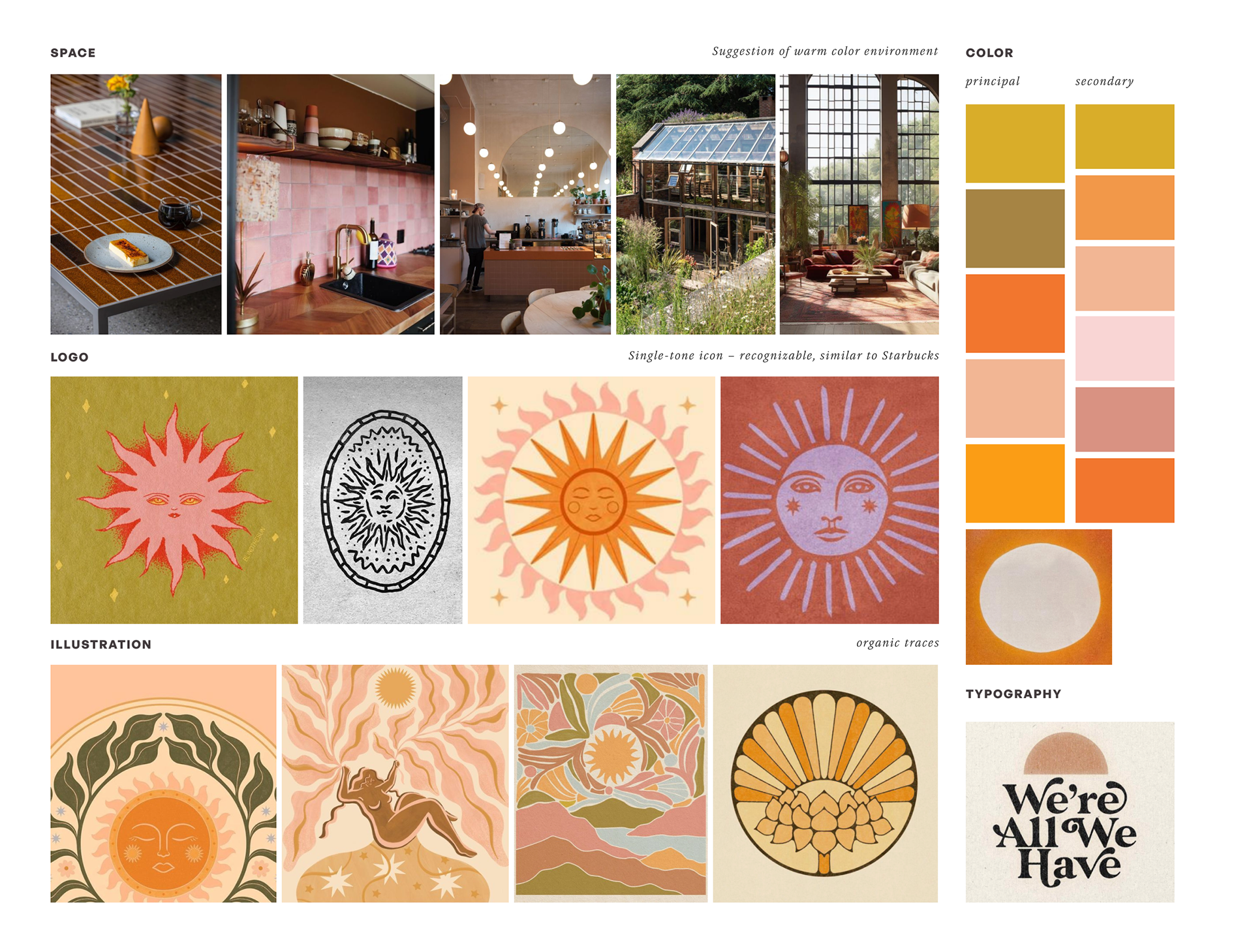
the design process
The initial concept centered around a sun with 11 rays, symbolizing enlightenment, intuition, and abundance. The sun was designed with delicate, feminine facial features, incorporating a flower on the forehead to represent light, growth, and the essence of spring. Supporting elements such as stars and floral details were added to reinforce the brand’s creative and luminous identity.
The expression of the sun was key: the eyes were designed to convey calmness, presence, and inner awareness, while the lips suggested pleasure and sensory enjoyment—reflecting the experience of taste and connection to coffee.
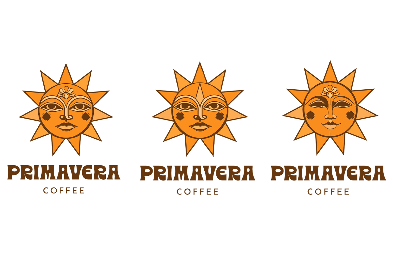
Initial drafts
Proposal 1
A version with closed eyes, evoking calmness, introspection, and a moment of quiet enjoyment. The five-petaled flower reinforces a clear visual connection to spring.
Proposal 2
A version with open eyes, representing focus and awareness. The upward-facing flower symbolizes growth, expansion, and openness to new experiences.
Proposal 3
A more dynamic version with open eyes and a typographic variation, designed for flexibility in applications where the symbol is not required or for vertical formats.
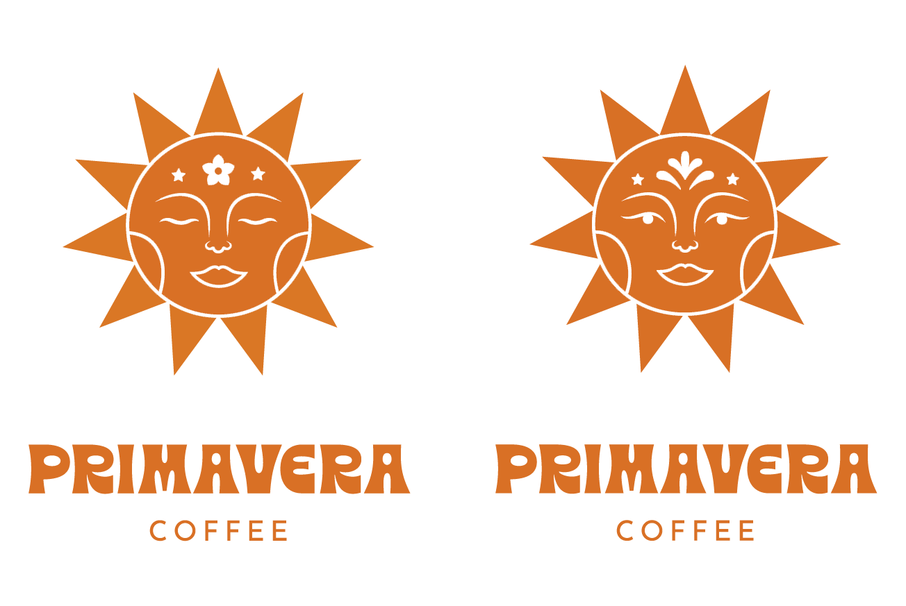
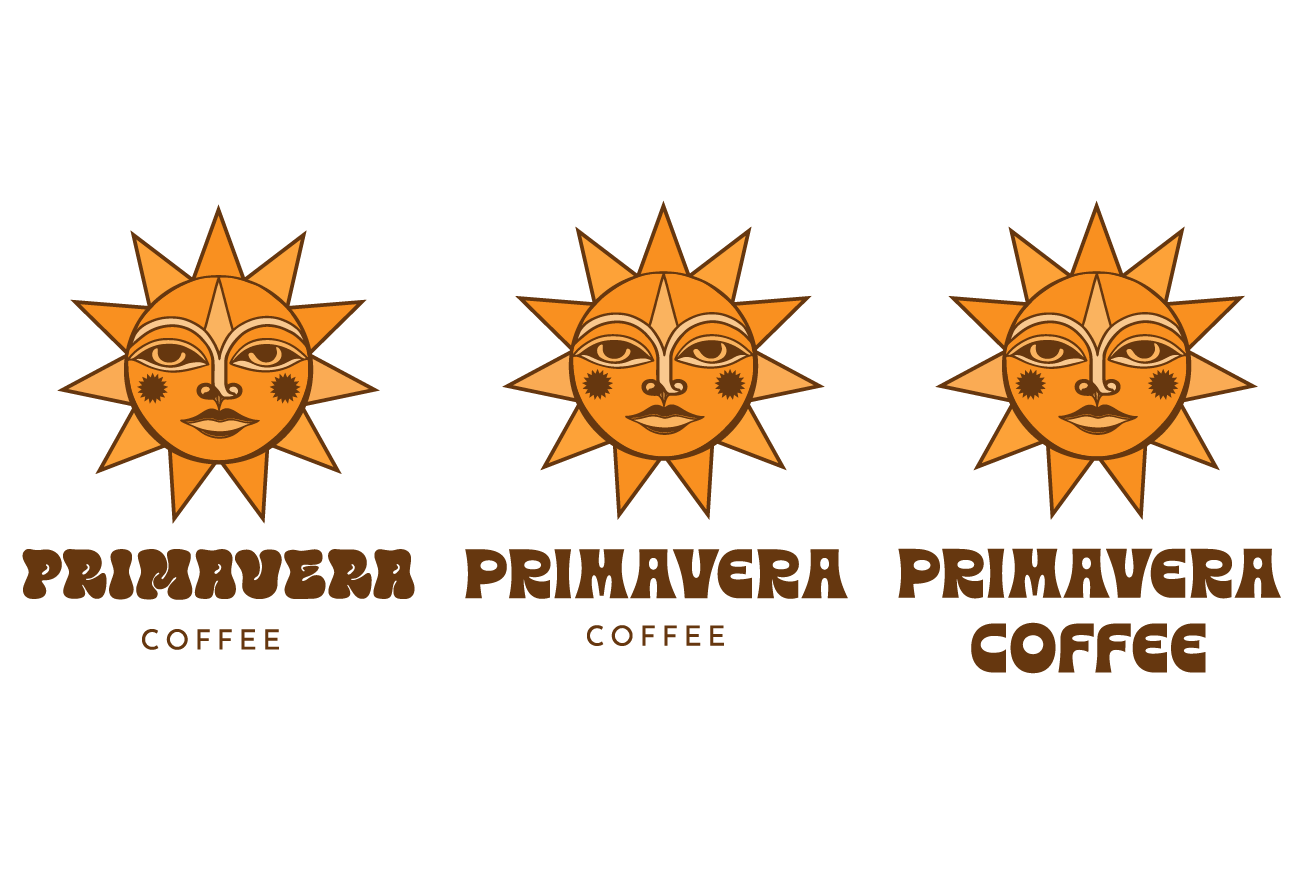
Post-feedback iteration
Following internal feedback, the flower was refined, the color palette shifted to a warmer yellow to better represent the sun, and rounded cheeks were added to enhance warmth and approachability.
However, during this phase, we identified an important opportunity. While the sun symbol was strong, memorable, and visually distinctive, with a simple yet intriguing Latin American character, it lacked vitality and emotional depth. At times, it felt static and mask-like, particularly in the eyes, which appeared empty and did not fully convey a clear or engaging emotion. This limited the connection with the viewer.
To address this, we refined the concept to ensure the logo would not only remain simple, bold, and iconic, but also feel alive, warm, and expressive—reflecting the inviting and inspiring essence of Primavera Coffee.
Typography was also a key component of the system. The typeface needed to balance a bohemian and modern personality, combining commercial appeal with creative elegance to fully support the brand identity.
This stage established the foundation for a logo that is both timeless and emotionally resonant—where culture, quality, and creativity converge.
Throughout the process, multiple iterations were explored to achieve a more organic, expressive, and authentic representation of the brand.
conceptualization and vision
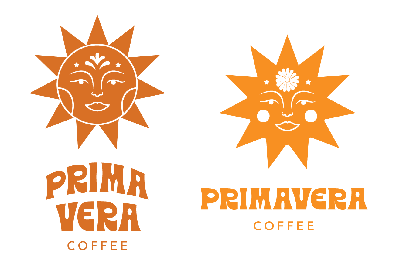
Proposal 1
Explores a warmer, multi-tone color palette inspired by sunlight and coffee. The flower on the forehead represents spring, while rounded cheeks reinforce the sun imagery and enhance the Latin character of the design.
Proposal 2
Replaces the flower with a triangle symbolizing light, energy, and growth. Facial features are refined to feel more organic and aligned with a bohemian aesthetic.
Proposal 3
Introduces more defined facial features and rounded cheeks, with an upward gaze to evoke aspiration and inspiration.
Typography Exploration
A series of bohemian-inspired type explorations were developed. The final recommendation prioritizes typographic hierarchy, avoiding the use of two dominant typefaces to clearly differentiate “Primavera” from “Coffee” while maintaining visual harmony.
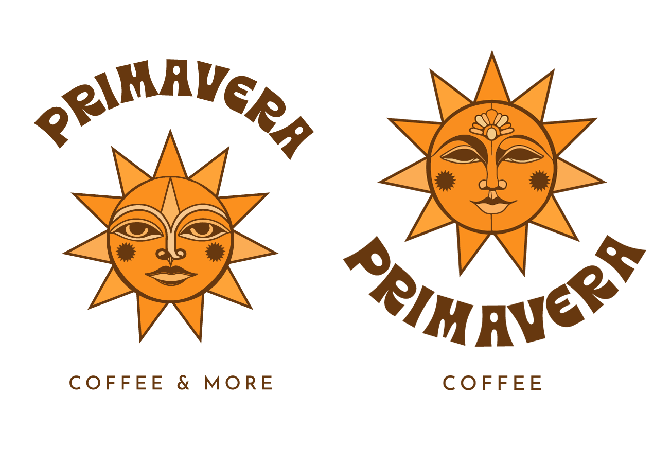
Typography Position
Includes a typographic variation where “Primavera” integrates more fluidly with the sun form. The typography follows a circular composition, enhancing the sense of radiance and cohesion.
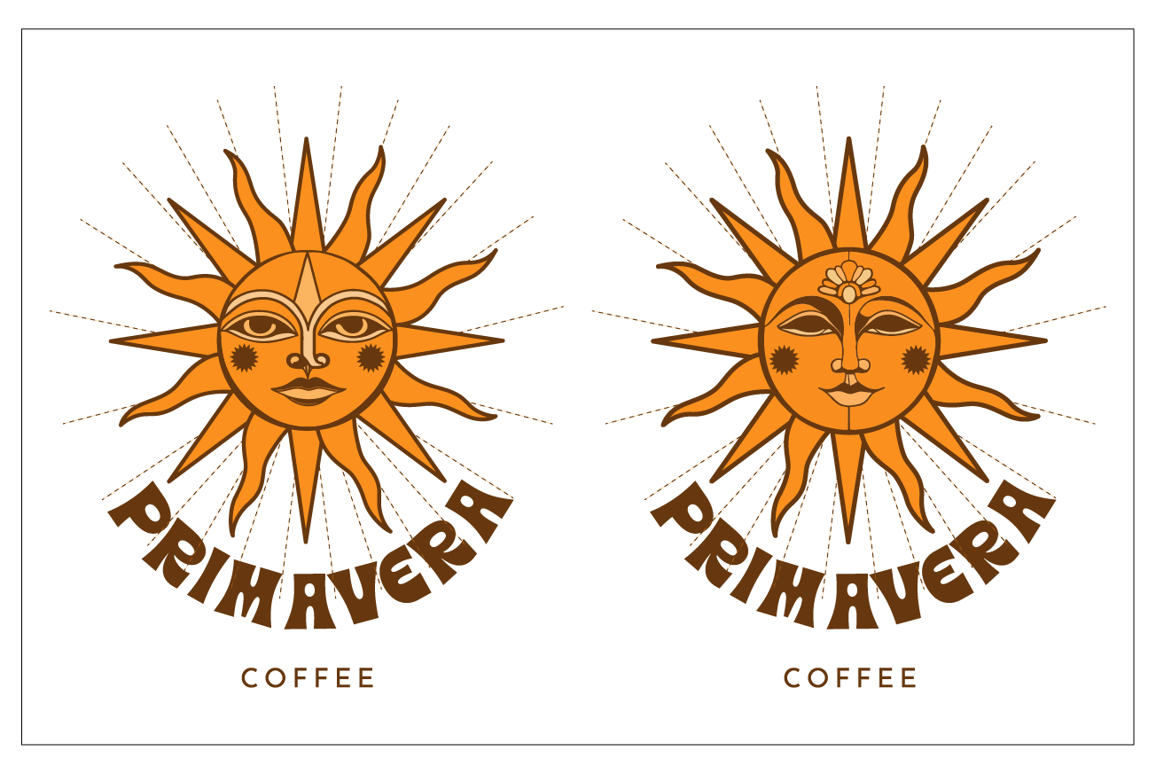
Variation in Rays
To enhance the expressive quality of the logo, the rays were refined to feel more organic and illustrative. Instead of uniform, digital shapes, they introduce subtle irregularities and texture, giving the mark a more natural, artistic, and human feel.
REFINING THE LOGO DESIGN PROCESS
At this stage, the graphic direction was already closely aligned with the vision. The focus shifted toward refining key elements to elevate the logo into a more expressive, cohesive, and emotionally engaging identity system. The following adjustments were explored to strengthen both its visual impact and its connection to the brand.
Texture Enhancement
Texture was introduced to soften the digital feel of the mark and bring a more tactile, artisanal quality. A subtle washed or pigmented effect adds warmth, depth, and a more organic presence.
Line Complexity
The line work was refined to feel more handcrafted and less rigid. By varying line thickness throughout the sun’s shape and rays, the logo gains rhythm, imperfection, and a more natural, human quality.
Facial Features
The facial expression was enhanced to create a stronger emotional connection. The eyes were redesigned with irises and pupils to feel more alive and expressive, conveying calmness and warmth. The cheeks were softened into rounded forms with a subtle pigmented effect, while the triangle on the forehead was preserved and better integrated to maintain balance and symbolic clarity.
Sun Rays
The rays were refined to appear more illustrative and organic. Subtle irregularities, internal detailing, and tonal variation were introduced to reduce uniformity and enhance their artisanal character, while maintaining overall balance and consistency.
Color
The palette evolved into a more luminous and dynamic system. The brown tone was deepened to evoke coffee and chocolate, adding richness and warmth, while complementary tones were explored to create contrast and visual depth without losing cohesion.
Typography & Placement
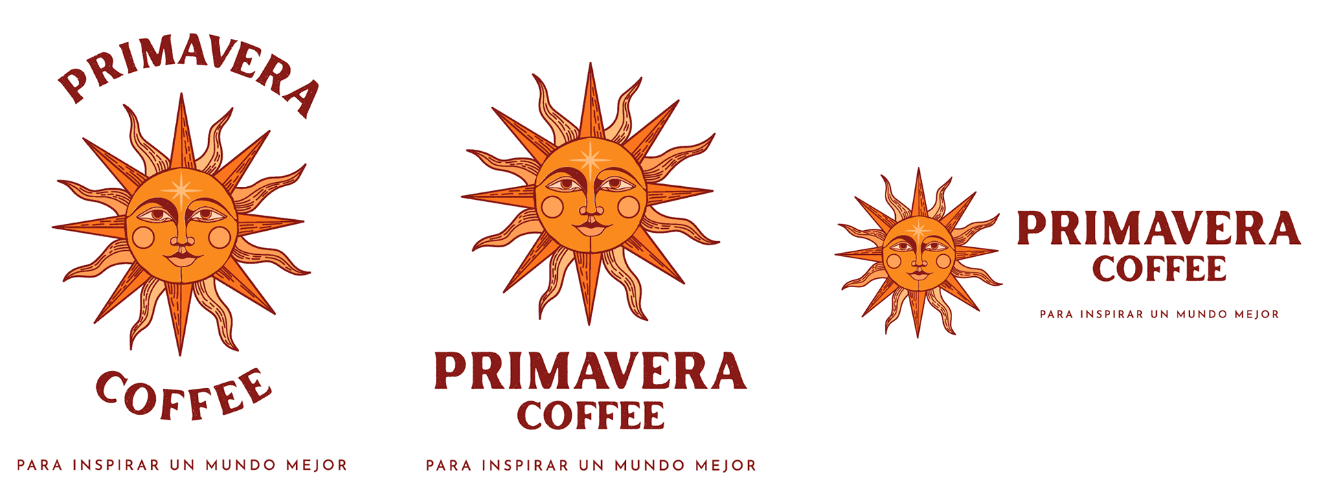
Typography was refined to balance clarity and personality, selecting a typeface that feels both elegant and approachable. Hierarchy between “Primavera” and “Coffee” was carefully adjusted, while multiple layout explorations—from circular compositions to more structured alignments—ensured flexibility and strong brand recognition across applications.
COLOR EXPLORATIONS
Text Color Variation Proposal
A polychromatic approach using the full color palette, with typography in a warm yellow-orange tone to maintain brightness and align with the sun’s dominant color.
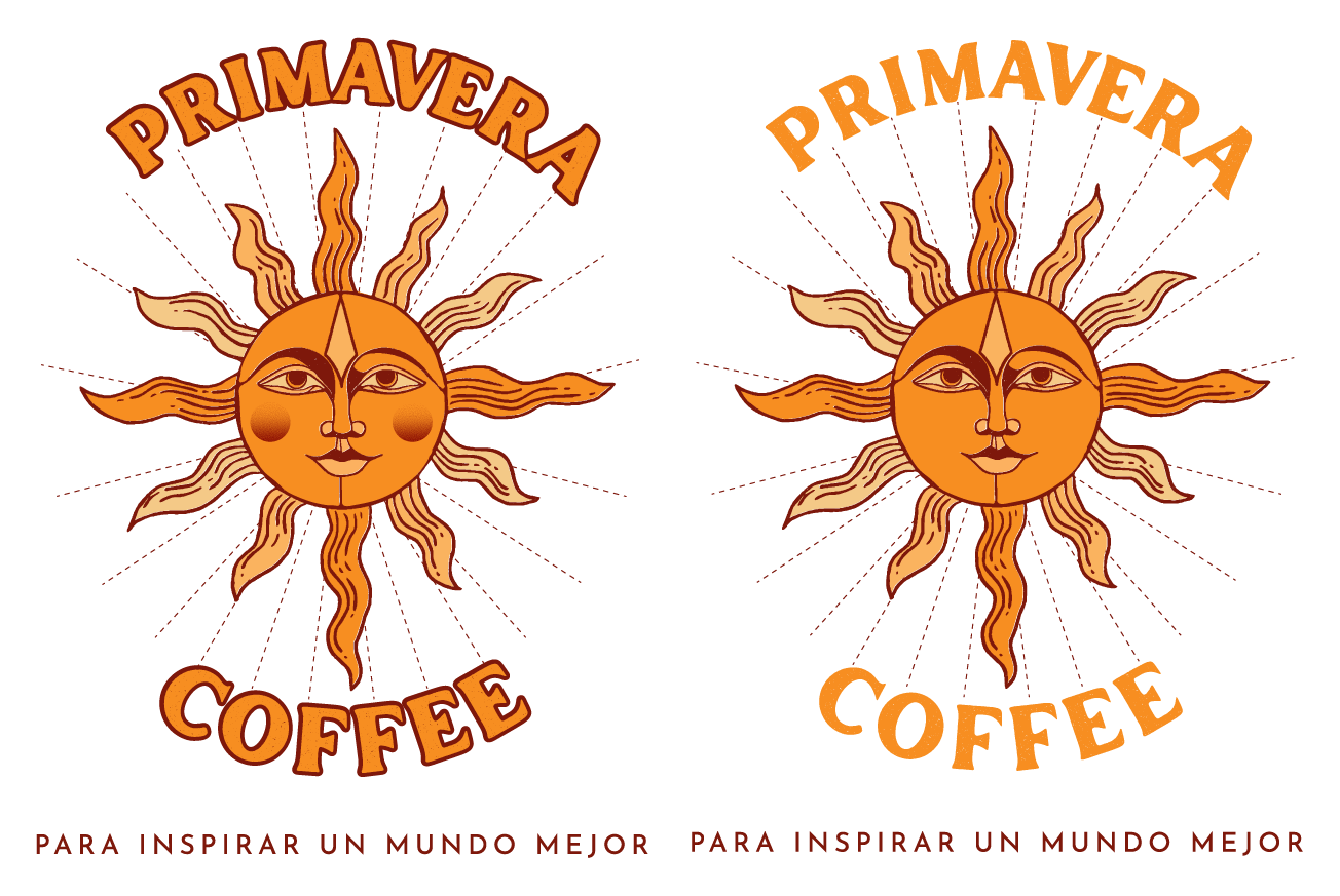
Alternative Direction
A variation introducing coffee-toned typography, creating stronger contrast while reinforcing warmth and connection to the product.
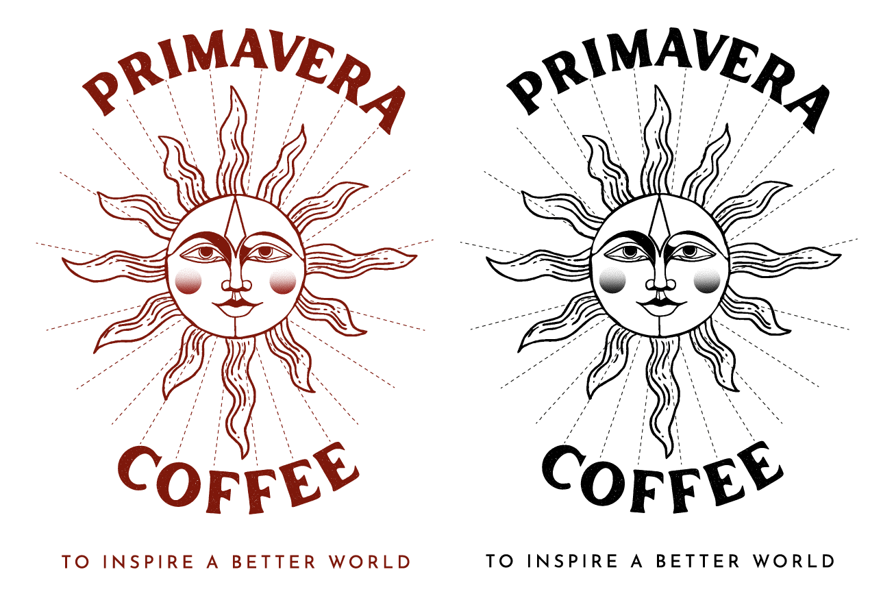
Monochromatic Proposals
Explorations included simplified versions with all line work in a deep brown paired with white, as well as a black-and-white option. These versions ensure clarity, versatility, and strong visual recognition across different applications.
COLOR EXPLORATIONS
Previously Selected Direction
Multiple tests focused on enhancing the prominence of the sun, particularly the forehead symbol and rays. Internal line details within the rays were reduced to avoid visual overload, while typographic placements were refined. This phase resulted in balanced versions, including negative and black-and-white applications.
Exploration Variations
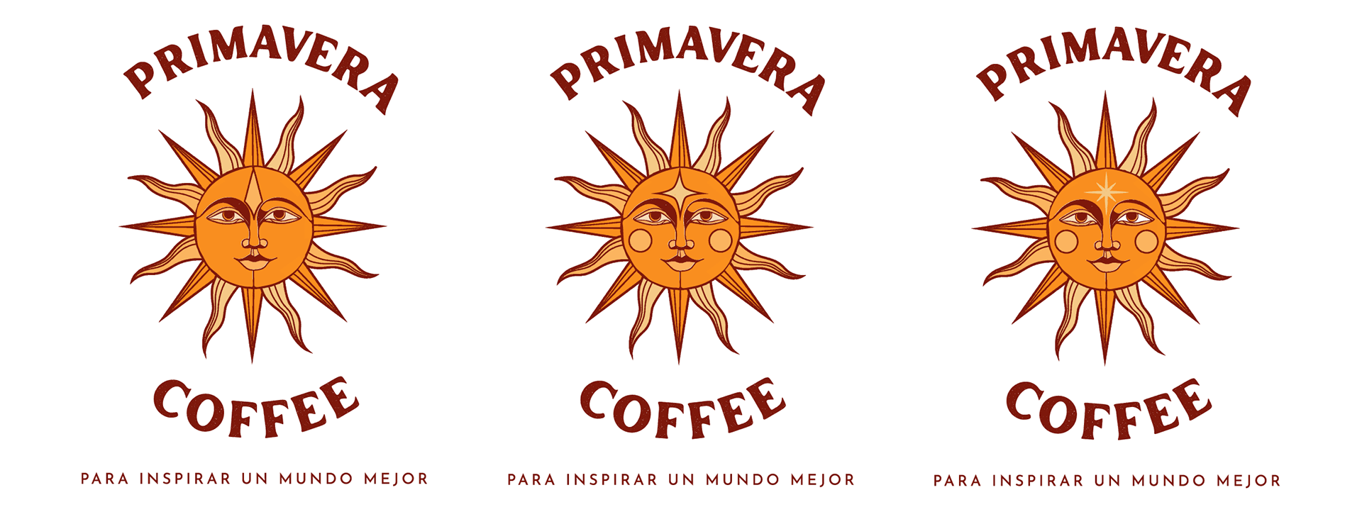
Further refinements introduced more organic, expressive strokes in the rays to achieve a natural and artisanal feel. Variations of the forehead symbol were also explored, including both star and triangle forms, each representing light, energy, and growth.
FINAL DECISION
The final direction combines clarity with expressiveness. The rays were refined with more organic and irregular strokes, incorporating subtle textures and illustrative details to enhance the handcrafted quality of the mark. Tonal variations from the color palette were applied to create depth, while maintaining the balance between straight and curved rays established in earlier iterations. Typography was adjusted to ensure harmony with the symbol, resulting in a cohesive and balanced composition.
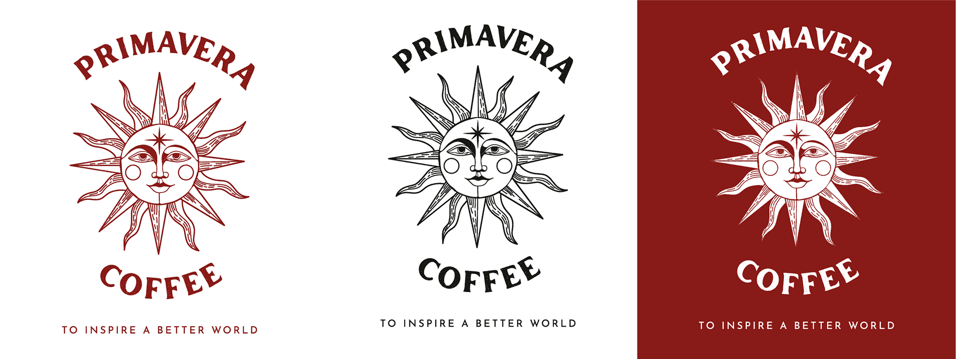
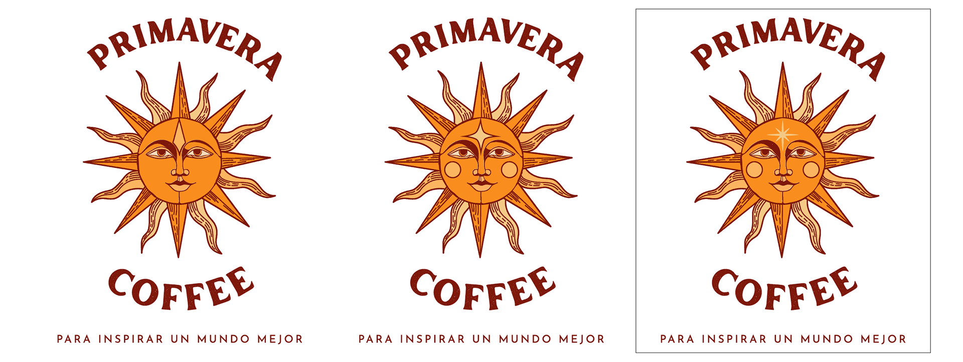
To ensure versatility, black-and-white, negative, and single-tone versions of the logo were developed. These variations allow the identity to remain consistent and recognizable across a wide range of applications, from light to dark backgrounds, while preserving its character and visual integrity.
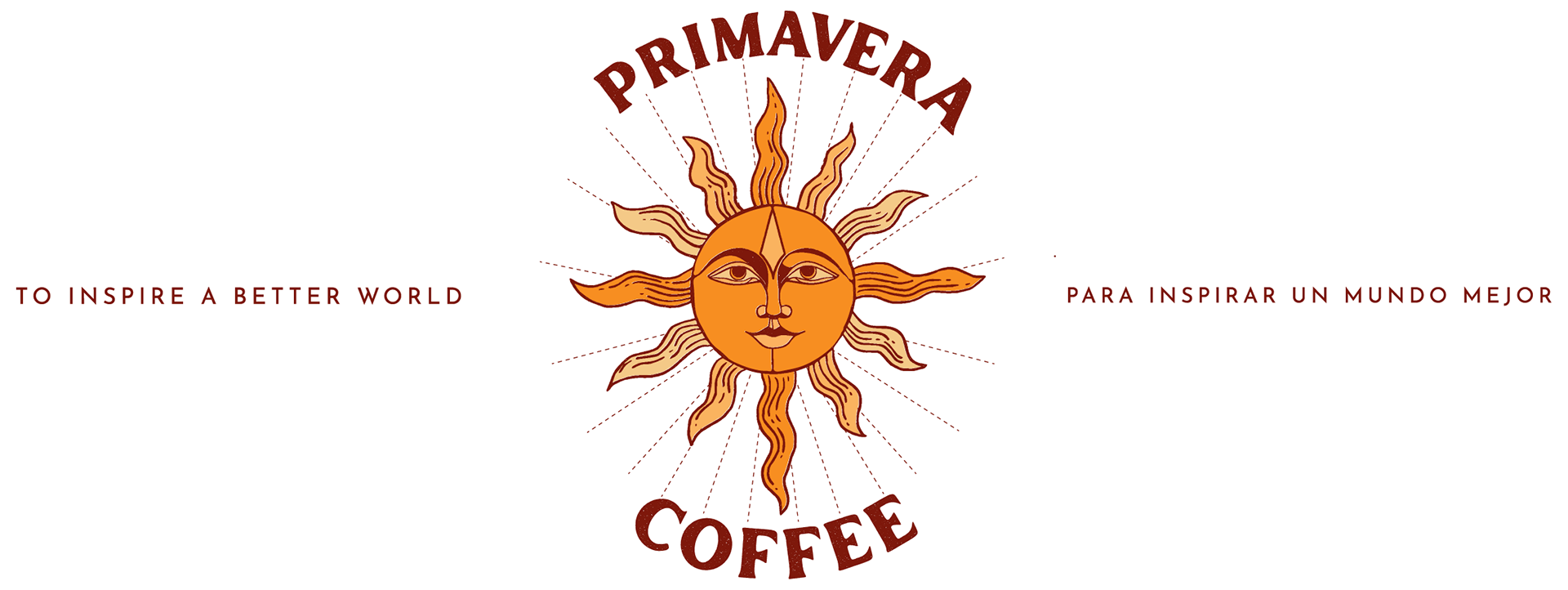
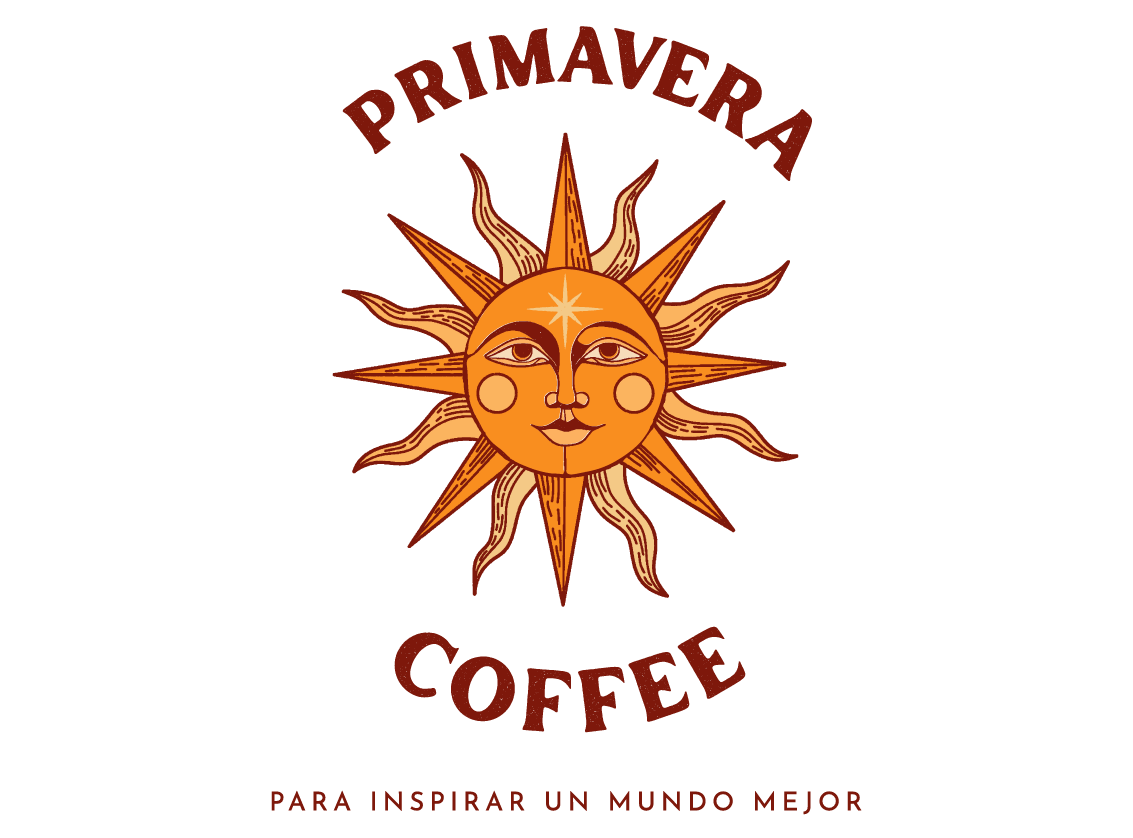
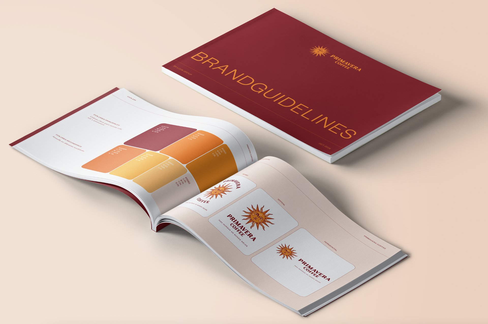
BRAND GUIDELINE | FINAL DESIGN
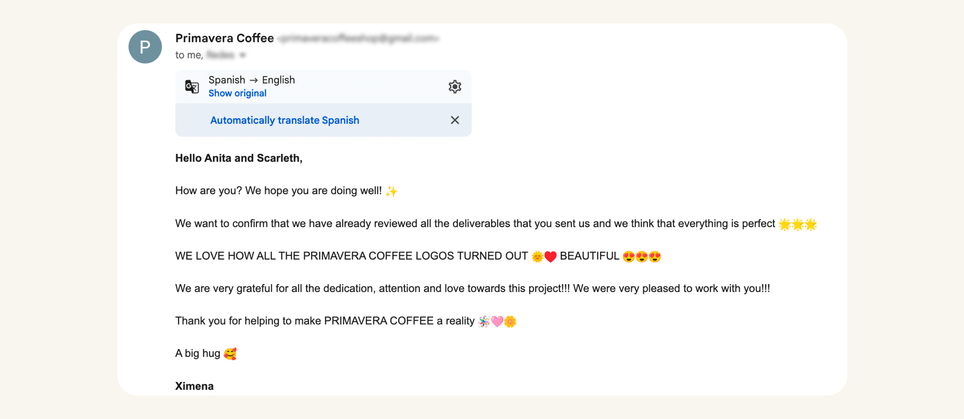
FINAL CLIENT THOUGHTS